After tuning into parts of Google’s IO conference last month, news about version 3 of the Maps API slowly made its way into my waking consciousness. I had some time last week to explore this newer, cleaner Map interface as part of a project I’ve been thinking about. I wanted to get a handle on competition in the broadband sector, a topic I’ve been covering since the start of this blog, and was hoping to use visualization tools to get answers and also generate new questions.
While trolling the FCC’s Gov 2.0 sitelet, I came across files containing service provider competitive data. I then learned about the extensive data the FCC captures from carriers on a per zip code basis as part of its “Form 477” database. Some of the 477 statistics are publicly available, but much is still closed off, (Hey, FCC open those files!)
I just needed a way to render zip codes into geo data suitable for mapping. A few more Google searches led me to state-by-state files of zip code polygon paths at the US Census Bureau’s page of cartographic boundary data.
I had enough to get started.
For my purposes, visualization would be useful to get an initial sense of what it would mean to deploy high-speed broadband nationwide. But after looking at 50 separate state zip code boundary files, I decided with my limited computing resources (and patience for programming) it would be better to just focus one one state, say New York, my previous “state of mind.”
The FCC competitive data, unfortunately, was from 2004. No the latest, but good enough.
While the Javascript coding to load the data—the hard part involved the Census’s zip code indexes—was more than I had planned to take on, the mapping part was a breeze, thanks to Google.
Non-coders can skip ahead. Here’s a snippet for loading an array of latitude-longitude coordinates defining each zip code into the Google Map’s Polygon overlay function:
for(var p=0; p

var latlong = data[2][p];

points=new google.maps.LatLng(parseFloat(latlong[1]),parseFloat(latlong[0]));

path.push(points);

}

paths = new google.maps.Polygon({

path: path,

strokeColor: "#000000",

fillColor: fill,

fillOpacity: 0.6,

strokeOpacity: 0.5,

strokeWeight:1

});

paths.setMap(map);
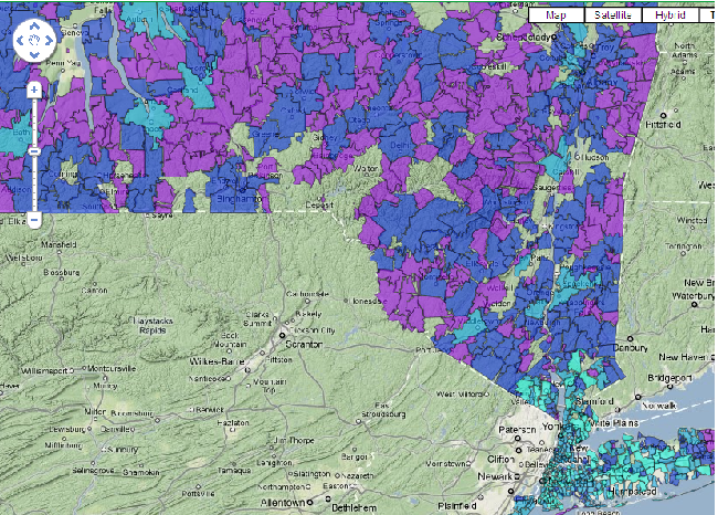
I coded the fill color based on the number of carriers in a zip code: light blue for 17 or more companies, darkest purple for 4 and under, and shades in between corresponding to groupings of four.

Number of broadband providers by zip code in NYS>
My first reaction when I began looking at my Google competition map was “wait, there are zip codes in Manhattan with over 20 service providers selling broadband?” I began to realize the FCC competitive data file included business service providers in their counts. And in Manhattan and other New York State cities that probably means metropolitan fiber deployments.
Ok, business owners see a competitive environment when shopping around for Internet, video, and other data access services. But then looking outside the urban areas, there are vast swaths of the ex-urbs and rural regions where the total number of broadband providers is under 3.
And for residential customers everywhere, the number of tenable service providers is usually three and under. In big cities, consumers again have a little more choice, though I can’t prove that with the FCC files I am using.
Bottom line: you begin to realize the importance of propelling the Universal Service Fund into the Internet era so that can it funnel money to under-served areas to build out broadband: in the end that should act as a powerful economic stimulus for local economies.
I’ve just scratched surface of Google’s Map APIs, and there are other applications I’m mulling over (hmm, maybe I can hook this into some Tropo APIs and turn this into an interactive Gov 2.0 app…).
I’ll let you know what I come up with.

