Last September I remember being excited by the great visual data presentations at O’Reilly’s Strata Summit. Somewhere around that time I also signed up for Visual.ly’s infographic generation app. Visual.ly, by the way, was founded by some of the key players behind Mint.com. In any case, I got the invitation to try their first iteration of Create, which lets non-visual artists produce professional looking infographics.
Visual.ly does more than just put training wheels on graphics software. It started out as a place for data artists to market their number-crunching masterpieces. I could spend the rest of the day getting lost gazing at these things. Visual.ly still does that, and has over 12,000 uploaded and shareable infographics.
With Create, you’re given a set of templates in which to structure data points from Twitter and Facebook. When I started writing this post, I assumed their cloud-based oompa loompa artisans would be able to finish generating my embed object, but they seem to be working off their weekend partying.
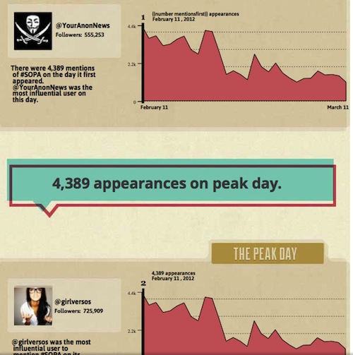
So what I have instead is an infographic jpeg snippet, based on their “Life of a Hashtag” template, which was given the Stop Online Piracy Act–remember that?-tag of #SOPA.


