I was at the O’Reilly Strata Summit yesterday, which is a gathering of data miners, visualization geeks, CIOs, data base developers and hackers, journalists, and NoSQL evangelists.
Journalists?!
I noticed that the afternoon session would have a talk by Simon Rogers, a Guardian editor, on the subject of data-driven journalism. I knew I had to investigate this seeming anomaly.
Glad I did. Rogers edits The Guardian’s influential Datablog, which has shown the old media Luddites how to present and interpret large datasets.
And he’s done this with open-source tools that anyone can access.
What I like about this new kind of journalism is that the actual story is not based on anonymous sources or glorified stenography, but rather on doing the difficult but ultimately game-changing grunt work of gathering, analyzing, and presenting public data.
Sometimes the dispenser of the data—read government agencies—don’t make the job any easier. From what I gathered, Rogers and his staff have had to spend long hours cleaning up cryptic spreadsheets, parsing bureaucratic memos, and pulling numbers out of masses of PDF documents.

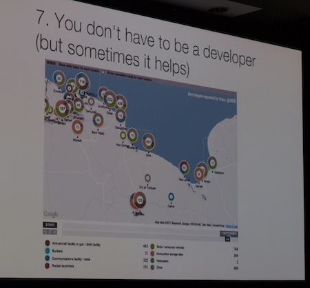
Mapping Libyan strikes based on NATO memos
It ain’t glamorous. But the resulting news stories that come out of this are significant. Recently, Datablog produced a day-by-day mapping of NATO strikes in Libya.
So how did Rogers do this?
“Everyday NATO has a briefing update, just a PDF, about 25 pages, it shows the number of attacks the previous day: where they hit and what they hit … So essentially that’s a set of data, albeit in a terrible format. We enter that data.”
After a few weeks of data entry, Datablog put together an interesting, time-based visualization (see below).
When the data is particularly clunky or not amenable to parsing, and there’s plenty of it, the Datablog team will rely on crowdsourced help from its readers.
They took that approach with an investigation of individual MPs expense reports, where they were able to get a hold of an unwieldy 400,000 PDFs. According to Rogers, Datablog with help from its dedicated readers produced interesting, but perhaps not ground breaking stories on Parliament members’ spending habits.
With open data, as Rogers explained it, journalists are “not always the experts on everything”. Instead they have to embrace the expertise of others, relying on crowdsourced input, software developers, data analysts, and visualizers.
Said Rogers: “There are things that people are good at it. I’d like to think I could be a great designer and I could be a great data analyst. I’m neither of those things. I’m kind of OK at both. But there are lots of our people who are good at this.”
Interestingly, though expertise matters, Rogers specifically chooses open-source visualizers, such as Google Fusion Tables or Many Eyes, and easy-to-master Tableau software so that the readers and generalists can recreate and presumably expand on articles in Datablog.
For a particularly eye-opening example of the Datablog team’s work, check out their visualization (see below) of the recent London riots.
By collecting court records, they were able to plot both where incidents happened and the home addresses of the rioters. Their visually deduced conclusion: it’s not quite a clear cut case that “these riots are not about poverty”, as David Cameron said.
Now, this is journalism.
I am inspired to do some of my own data-based or—let’s not mince words here—empirical, reality-base reporting. Maybe you are too.
FYI: The Guardian publishes its data sets in the Datastore section of the site.
Related articles
- Rogers is ‘internet journalist of the year’ (guardian.co.uk)
- Guardian Datastore (guardian.co.uk)
- MPs’s Expenses. What you’ve told us. So far. (guardian.co.uk)
- NATO attacks in Libya: key targets, day by day (guardian.co.uk)
- England riots: was poverty a factor? (guardian.co.uk)
- Google fusion tables (google.com)

