
I received an email from my friends at MapD. They’re the Harvard-MIT spawned “data exploration” company. That’s a poetic way of saying they do speedy database queries using parallel computing elements. Anyway, they scooped up all the available public data on political donations since 2001 and then mapped it.
It’s mind boggling to see all this data visually in their demo. You can filter on a slew of different fields — location of donor, amounts given, date of donation, etc. — and then see it or drill down into actual tables.
It’s a lot of fun, in a wonky way, to play with the app. You quickly discover there’s too much money going into the elections: over $2 billion for the 2016 cycle!
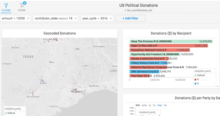
Anyway, I did a search of donors who gave more than $10,000 in the current cycle. Not surprisingly, there’s a a lot of wealthy people in Texas. Unfortunately, this freebie demo app is not embeddable, but I took a snapshot (below).
It’s well worth your time to get a MapD account and explore for yourself.