Can a motivated Every(wo)man without a deep financial background analyze some of the great economic themes of the day– inflation, government spending, EU austerity? Princeton graduate (Go Tigers!) Greg Ugwi has come up with something like Wolfram Alpha for charting GNP, GDP, T-Bills, CDs, CPI (yes, with food and energy included), Case-Shiller housing prices, and a slew of other metrics. His Jersey-based startup, called ThinkNum, is premised on the idea that we all should have access to a free Bloomberg-like terminal.
In recent years, I’ve been educatin’ myself in the dismal science by reading a few select econo-bloggers. I’ve alway found the peak-to-trough charts in these type of blogs comparing, say, The Great Recession to past economic seismic events to be informative and perhaps useful in some of my other projects, but outside my skill level to create such things. That’s where ThinkNum steps in.
Ugwi’s goal is to give Main-street investors a simple-to-use charting tool that taps into some of the macro-level data that the big boys have at their fingertips. Brief disclosure: Ugwi worked for one of the enfantes terribles of Wall Street, but is now using his deep knowledge of data analysis to create a financial app for the rest of us.
In researching this post, I learned there are other econ graphing tools available on the Web: for example, the World Bank has a nice plotting tool on its site, and a world-famous Princeton blogger favors a charting tool from the Federal Reserve Bank. What ThinkNum has going for it is that it lets you create interactive and embeddable graphs using very simple commands.
The Wolfram Alpha comparison is a not a completely unfair one, and in fact Ugwi tells me (in an email) that it was part of the inspiration behind ThinkNum. Though it doesn’t have Alpha’s natural language capabilities, once you learn the macro commands–or you can simply click on their helpful tree of time series data–you can then assemble it all in Alpha-like fashion into more complicated algebraic expressions. For example, to graph the spread between 10 and 2 year treasure rates, you subtract one variable from the other.
ThinkNum also provides basic statistical functions–moving average, linear regressions, etc. In my own experiments, I found a remarkable relationship between GDP and capacity utilization: when one rises so does the other. Seriously, you get the idea: use ThinkNum as an econ sketchpad to work out your own ideas, and also share your creations with others through ThinkNum’s gallery feature.
ThinkNum also provides web APIs, allowing its data to be fed into other apps. It also has attracted R users through its own package, which means you can then let this statical language’s enormous machinery take over.
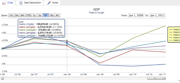
ThinkNum is clearly in a beta state, so don’t expect it to work perfectly or to have complete documentation. For example, I wanted to embed an interactive peak-to-trough graph of several countries’ GDPs, but couldn’t get it to display a percentage change from a baseline. Instead, you’ll find below a snapshot of the interactive graph taken directly from the app, where it performs just fine.
Another caveat: ThinkNum is not meant as a trading tool, so there are no real-time feeds. As Ugwi explained, trading screens are an over-served market, which I absolutely agree with.
Overall, this is excellent work, and analysts, strategists, data journalists, and marketers will find ThinkNum well worth their time. We look forward to seeing a more mature app in the near future.


