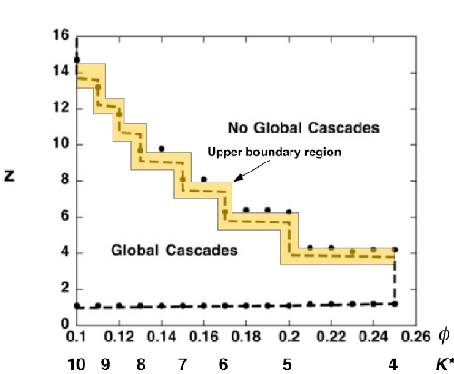
To review, the theory behind viral marketing is that influencers infect their neighbors with an idea, preferably related to purchasing something. These neighbors then spread the idea to their network neighbors, thereby initiating a cascade— the network tips. Of course, this is what you learn in Tipping Point 101. But what if Gladwell’s idea is not quite right. Duncan Watts, Professor of Sociology at Columbia and social network contrarian, has evidence that influencers may not be that influential. There’s a diagram that explains it all.
Before we get to the diagram, a little background in social network theory is in order. Random graphs, which have been studies since the 1950s, are used as a model for real-world social networks.
In a random graph, nodes represent people (or web sites), edges indicate a relationship (or links between sites). When generating these graphs through computer simulations, randomness comes into play in deciding whether to create an edge. And, it turns out, that the critical factor is the probability of edge creation.

In the late 1950s, mathematicians Paul Erdös and Alfred Rényi proved that lots of useful properties magically appeared when this probability crossed certain barriers. One of those magical things is the emergence of cascades—highly connected components.
So now to the diagram. Building on the random network model and tweaking it to include a measure of vulnerability, called a threshold, Watts was able to show that in certain cases the influencer’s power drops off!
At this point, I’m obligated to say— imagine I’m using my Rober Krulwich voice —that the particular random graph model that Watts used misses a few key characteristics of real-world social networks (read Facebook, Twitter, and the rest).
It’s still useful as a first approximation, and Watts worked with this model in his paper. Side note: one of Watts’ achievements was to develop a random graph theory that more faithfully represented these social networks. (Editor’s note: can we get to the diagram?)
So here’s what Watt’s discovered (see diagram). In the lower left, you’ll notice a horizontal line. That’s the first “tipping point”, which corresponds, in random graph theory, to a phase transition. A sudden transition occurs when the average number of edges approaches one: it’s the point when large connected components in the graph are formed.
The x-axis represents the threshold, which is a straight forward percentage of the number of infected neighbors needed to convince you to accept an idea. When the network starts forming a large component (at z=1), and the thresholds are low, you can achieve a cascade of the idea (buy Pet Rocks).
However, when the average connectivity increases—now go straight to the upper left— the influencer’s power starts to wane: since I’m connected with so many others, one person’s opinion is not enough to exceed my threshold.
In his modeling and through simulations, Watts noticed that cascades that occur in the upper part of the graph are rare, but massive in terms of the size of the component that is infected,
For the lower part of the graph, at about two connections per person, the cascades are more frequent, though not infecting as large a component —a big movie hit, but not say, Avatar.
That’s almost it. There’s a lot of quibbles you can make, but Watts model does back up a different view of viral marketing: forget about the influencers, find people who are connected to a vulnerable, low-threshold community. I’ve done my own modeling supporting this view in another post.

